Understanding:Success Criterion 2.4.11: Focus Appearance (Minimum)
Success Criterion 2.4.11 Focus Appearance (Minimum) (Level AA): When user interface components receive keyboard focus, all of the following are true:
- Contrasting area: There is an area of the focus indicator that has a contrast ratio of at least 3:1 between the colors in the focused and unfocused states.
- Minimum area: The contrasting area is at least as large as either:
- Outline: the area of a 1 CSS pixel thick perimeter of the unfocused component, or
- Shape: the area of a 4 CSS pixel thick line along the shortest side of a minimum bounding box of the unfocused component, and no part of the contributing area is thinner than 2 CSS pixels.
- Adjacent contrast: The contrasting area also has a contrast ratio of least 3:1 against adjacent colors in the focused component, or the contrasting area has a thickness of at least 2 CSS pixels.
- Not fully obscured: The item with focus is not entirely hidden by author-created content.
A keyboard focus indicator which has a pattern or gradient may have parts that do not meet the 3:1 contrast ratio for the change of contrast, as long as an area equal to the minimum does meet the contrast ratio.
If the component has a visible boundary smaller than the hit area, or the size of the component is not available, the minimum area can be taken from the visible boundary.
The working group is interested in feedback about the minimum area metric, and if there are unusual scenarios where visible indicators are caught by the wording.
Status
This understanding document is part of the draft WCAG 2.2 content. It may change or be removed before the final WCAG 2.2 is published.
Intent
The purpose of this Success Criterion is to ensure a keyboard focus indicator is clearly visible and discernible. This criterion is closely related to 2.4.7 Focus Visible and 1.4.11 Non-text Contrast. Where Focus Visible merely requires a visible focus indicator, 2.4.11 defines a minimum level of visibility. Where Non-text Contrast requires a component to have adequate contrast against the background in each of its states, 2.4.11 requires sufficient contrast between the focused and unfocused states.
For sighted people with mobility impairments who use a keyboard-like device (e.g., a switch, voice input), knowing the current point of focus is very important. Visible focus must also meet the needs of low-vision users, who may also be keyboard-only users.
A keyboard focus indicator can take different forms; this Success Criterion sets a requirement to make it clearly distinguishable. For example, using a thick outline that contrasts with the background would pass this criterion.
The default focus indicators in some browsers can be difficult to see, such as a 1 pixel dotted outline, or a blue indicator which happens to be on a blue background.It is generally best to either define a keyboard focus style which meets this criterion, or test the focus styles across the browsers that are relied upon for conformance.
Keyboard focus
The keyboard focus is the point of interaction for someone using a keyboard. For environments with a keyboard-operable interface, the keyboard focus can be moved around the interface in order to interact with different elements. Whichever element is being interacted with has focus.
Some components have sub-components that can take focus, such as the menu items on a menu. The item considered to be focused is whichever is being interacted with. For example, if you tab to a menu and arrow down to a menu item, it is the menu item that is in focus; pressing Enter would activate the menu item.
Some non-operable elements can take focus (such as a heading element that is the target of a skip link); however, it is only when the element with focus is operable by keyboard that this Success Criterion applies.
Minimum area
The bigger the visible change when an item receives focus, the easier it is for someone to see. Authors are encouraged to make the change as significant as possible, for example, by designing a thick border around the element.
The Success Criterion defines a minimum area using a calculation for perimeter, and a secondary minumum based on the shortest side side of the control.
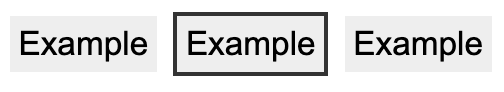
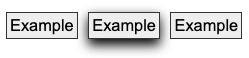
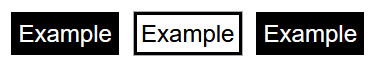
For the first calculation, the minimum area of the focus indicator must be at least as large as the area of a 1 CSS pixel thick perimeter (border) of the control in its unfocussed state. The indicator does not have to be a border, but the indicator's area must be at least as large. For example, if a control is a rectangle of 90px wide and 30px tall, the size of the outer border is 90 + 90 + 30 + 30 = 240 CSS pixels. You then must subtract the 4 corner pixels (which are counted twice, both horizontally and vertically), for a total minimum area of 236 CSS pixels.
A CSS pixel is what developers use in CSS declarations like “width: 200px”, it is device-independent
and not to be confused with device pixels which vary depending on the physical pixel
density.
The rest of this document notates CSS pixels as "px".
The following 3 examples use a 90px wide by 30px tall button, therefore the surface area requirement is 236px (240px minus corner 4 pixels). The middle button is focused in each example.
If controls change size across different variations of a page (e.g., in a responsive design), it helps to use a proportionally sized indicator such as an outline or background change. In that way you can be sure of meeting the size requirement.
The Success Criterion includes an alternative size measure of "at least as large as a 4 CSS pixels border along the shortest side, and no thinner than 2 CSS pixels.". This is included to allow for smaller but thick indicators. For example, some controls might be of a fixed height but variable width, in which case this measure allows for a more consistent approach. Although the area is less than the primary measure, the minimum thickness helps to maintain the visibility.
Typical focus indicators:
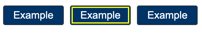
- A solid outline around the whole component would pass the size requirement;
- A 1 CSS pixel dotted outline around the whole component would not pass the size requirement, as it is roughly 50% of the surface area of a solid line.
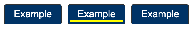
- Changing the background of a control would pass the size requirement;
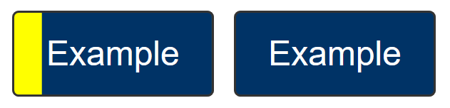
- A 1px wide vertical line (such as a blinking cursor) would not pass the size requirement, a text input would need a larger or separate focus indicator.
If you need to use complex mathematics to work out if a focus indicator is large enough, it is probably a sign that you should use a larger and proportional indicator that will provide a more visible indicator.
Where a focus indicator is defined in code as a certain size, e.g. 2px thickness, anti-aliasing can be ignored for the purposes of calculation. Dotted or dashed outlines have various levels of gaps depending on the browser, screen density, and thickness. For example, in most browsers a "dotted" line will have roughly half the number of pixels due to gaps. However, in some sizes or browsers it might be slightly less than half, so increasing the thickness may be required.
Unusual shapes and gradients
If you have an unusual shape, some mathematics may be required if the focus indicator is on the edge of the size requirement. For example, if the focusable control is a circle with a diameter of 100px, the circumference would be 314 pixels. A 1px (or greater) outline would meet the size criterion.

If a focus indicator is an irregular shape, such as a drop-shadow under a star icon, it helps if the contrasting area is quite large.

What is the contrasting area of the drop shadow? The quick method is:
- Look at the size of the component, how long is it around the edges?
- Look at the (contrasting) area of the focus indicator.
- Mentally compare the focus indicator to the border of the component.
If it is too close to call, you could extract the contrasting area of the focus indicator and evaluate the surface area.
If the control has a non-rectangular shape, the secondary size measure in the success criterion is not valid, the 1 CSS pixel perimeter is best suited for this purpose.
If a focus indicator has a gradient, the principle is to measure the contrast of the changed area, and ignore the change that does not meet 3:1.
If you take some spot-checks on the gradient area and establish what area meets the contrast, it is straightforward to work out if that area is sufficient.

If an inline link is broken over two or more lines the indicator can be split between them. In this case the link element is still treated as a single control.
Some designs have pages with a non-solid background image covering the whole (or part) of the page or make use of parallax scrolling effects which result in a near-infinite number of color combinations if a page is scrolled and/or changes are made to the viewport size.
If the contrast of background colors that change are close enough to need to be tested for each combination then they would likely not meet the user need of people with low vision in certain scroll combinations and would likely fail in certain combinations as well. In these cases it would be an easy solution to use a double ring focus indicator or some other mechanism to indicate focus such as a solid box with a border to guarantee there is sufficient contrast across variations of background images or background gradients.
Change of contrast
The greater the change of contrast between states the easier it is for users to see it. Authors are encouraged to make the change of color contrast as great as possible.
When a component changes to include a focus indicator, that change can always be measured as a change of color contrast. For example, if a yellow outline is added to a button on a blue background, the change of color is from blue to yellow.
Color contrast measurements in WCAG are based on luminance (brightness) regardless of the hue.
Text and non-text contrast measures use adjacent colors; this Success Criterion measures the change in color between non-focused and focused states.
If a control receiving focus changes its background (fill color) to a color that contrasts less than 3:1 with the original background, that would not pass the change of contrast.
If the background change is sufficient, it is a method of passing the criterion.
It is possible to use visual patterns such as strips switching places to disguise a change of focus indicator. This is not considered a visible indicator.
Adjacent contrast
Where a control is a solid color, and you add a border or outline of a very similar color, it is difficult to perceive the change to the control.

The requirement is to have an indicator that has a 3:1 contrast ratio with the adjacent colors of the component, or to be separated from the component, or to be at least 2px thick.


If the focus indicator uses several colors, any color which does not interfere with identifying the indicator can be ignored for the purpose of measuring contrast ratio. For example, a 3D drop-shadow on a focus indicator is considered to be subsumed into the color closest in brightness (perceived luminance). If the size is uncertain, calculate the minimum size based on the area which meets the contrast change requirement.
Not fully obscured
Where other content can overlap with a focused item, the focused element should not be hidden. Typical types of content that can overlap focused items are sticky footers, sticky headers, or non-modal dialogues. As a user tabs through the page, these layers of content can obscure the focused item, including the focus indicator. If the interface is configurable so that the user can move toolbars and non-modal dialogs around, then only the initial positions of user-movable content would be considered for testing and conformance of the Unobscured bullet.
The criterion specifies the "focused item" in the 'Not fully obscured' bullet rather than the "focus indicator". The requirements for the indicator are set in the previous bullets; the last bullet applies to the item as a whole.
Relationship to Non-text Contrast
Success Criterion 1.4.11 Non-text Contrast requires that a UI component maintains contrast against the adjacent background for each of its states. When it does not have focus, it must be visible against the background. When it receives focus, it still must be visible. However, Non-text Contrast does not require contrast between the UI component's focused and non-focused states, merely that in each state it contrasts against the adjacent background.
Focus Appearance (Minimum) requires that the focused and unfocused states can be distinguishable from each other. It does this by requiring sufficient differences in contrast between the appearance of a component when focused and when not focused.

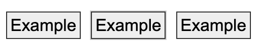
In the example above:
- The dark square outline of the checkbox has sufficient contrast with its adjacent light background in the default state (meeting 1.4.11 Non-text Contrast).
- When the checkbox receives focus in the second image, a grey ring appears around it. The ring contrasts against the light page background sufficiently (still meeting 1.4.11). The size of the ring's dark outline is large enough to meet the Minimum area requirement of 2.4.11 Focus Appearance. The color of the pixels making up the ring's outline versus the same pixels in the unfocused state meets the 2.4.11 Change of contrast bullet. The ring's outline also contrasts against the inside shading (another more subtle indicator of focus), so both the inner and outer edges of the ring's outline meet 2.4.11's Adjacent contrast bullet.
- In the third image, the checked state is indicated by two visual changes. The checkbox changes color from gray to a greenish teal, and the checkbox is entirely filled in except the outline of a white tick mark. The contrast between the white tick mark and the teal color of the checkbox is sufficient to pass the 1.4.11 Non-text Contrast requirement to identify its (checked) state.
- The fourth image shows the checkmark both checked and focused. The component still uses a ring to indicate focus. The ring's color has changed, but it still contrasts against the light page background and, on its adjacent inner edge, against the shading. (The color difference between the grey of the unchecked box and the teal of the checked version is irrelevant to the assessment. Since the tick mark indicates the checked state, the color change is just a secondary visual effect.)
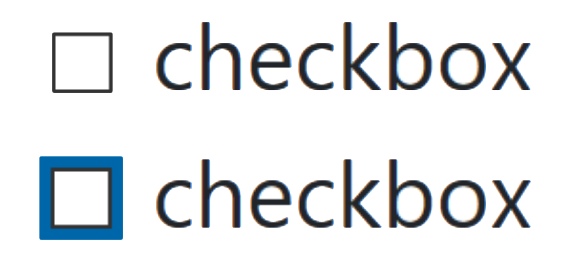
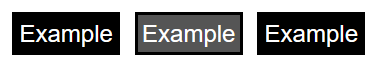
The contrast of the default checkbox passes 1.4.11 because the black border and white background have a contrast ratio greater than 3:1. When the checkbox receives focus, the dark blue focus indicator passes Focus Appearance (Minimum) because:
- Its thick blue border has a sufficient Minimum area.
- The pixels making up the blue focus indicator have a sufficient Change of contrast from their white color in the unfocused state
- The blue focus indicator, although not contrasting with the black checkbox border, has a thickness of 2 CSS pixels and so meets Adjacent contrast.
Benefits
- This Success Criterion helps anyone who relies on the keyboard to operate the page, by letting them visually determine the component on which keyboard operations will interact at any point in time.
- People with attention limitations, short term memory limitations, or limitations in executive processes benefit by being able to discover where the focus is located.
Examples
- When links receive focus, an outline is displayed around the link that contrasts with the background adjacent to the link.
- When buttons receive focus, and outline is displayed within the button (around the text) that contrasts with the button’s background.
- When text fields receive focus, an outline is displayed around the field, indicating that the input has focus.
- When radio buttons receive focus, an outline is displayed around the control, indicating that the input has focus.
Techniques
Each numbered item in this section represents a technique or combination of techniques that the WCAG Working Group deems sufficient for meeting this Success Criterion. However, it is not necessary to use these particular techniques. For information on using other techniques, see Understanding Techniques for WCAG Success Criteria, particularly the "Other Techniques" section.